Why an octopus?
I choose the octopus for two reasons:
a) We need a logo based on an animal, due the opensource nature of the project.
b) There is nothing more flexible than a octopus, and the F of FMS is “Flexible”: It can reach with their tentacles anything in it’s reach (I used to like scuba diving in that time)
First official version (2004)
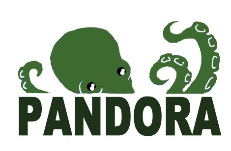
A project like Pandora, who turns 10 years shortly, has gone through many stages. As a child, his first versions (versions from 0.8 to 1.2) had a logo designed by Silvia, the wife of the original author of the project, Sancho Lerena. Do not forget that Pandora FMS initially was a personal project, something like a developer hobby, in his spare time. The logo is drawn by hand, scanned and retouched with GIMP. Curiously, there were several versions of the logo in Red, Purple and Brown. Finally the green grew to like the four buddies more at that time formed the core of the project.
First logo
Version 2.x (2005)
Over time, the circle of people who knew and wanted to help the project was expanding. Still confined to the field more focused on the OpenSource world within the professional circle, but just one of the requirements of the new logo and the project in general was closer to the world “professional”, with the intention that the software grew both in use and in features.
This logo is created by Anna, a very nice designer Sancho met at an event of the Free Software Foundation.
Logo of 2.x version
Version 3.x (2008)
Although the second logo was more professional than the first, we keep looking for something that takes us closer to the professional world. We began to think that the octopus can be confusing. Traditionally, free software projects are associated with animals, but is also a handicap as logo because it leaves the “professional world”.
The third logo, suddenly emerged. Sancho saw a t-shirt fun on the street and inspired the design of a sea of tentacles. The octopus was not shown directly, but it was a simple design. So Sancho became designer, and again using GIMP, created the third logo of the Pandora story, this time from the hand of its creator (although his wife helped a little).
Logo of 3.x version
Version 4.x (2011)
Finally we listen to those who know marketing and decided to make a professional logo. We commissioned the logo for a young design firm, Creative Suite, and from the hands of Marga -another woman again-, we created the logo which is still today, the official logo of Pandora. Octopus disappears and new ways, much more stylized, replace this cute animal, resulting in something new, much more professional.
Current logo, versions 4 & 5
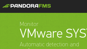
The logo is essential to the image of a product. And its simplicity allows it to be versatile in order to appear in different locations in multiple ways. As in Pandora FMS Metaconsole in its monochrome or the product web page..
Pandora FMS Metaconsole
Pandora FMS website
Version 5.x(2013)
The Pandora FMS logo has evolved into a whole new look. Our graphic designer, Carla, has created an even more stylish logo, respecting the history and tradition of the previous ones.
The current version preserves the characteristic tentacles of our beloved octopus, using “flat design” techniques to make it simple and attractive. In addition, Carla has created a softer colour palette with a special green tone. Our Pantone is 376 C.

Pandora FMS’s editorial team is made up of a group of writers and IT professionals with one thing in common: their passion for computer system monitoring. Pandora FMS’s editorial team is made up of a group of writers and IT professionals with one thing in common: their passion for computer system monitoring.


