


Pandora FMS has changed a lot since its inception, and you, dear reader, may have noticed it. Through effort and hard work it has grown older and become someone strong and capable.
As you know, a tool, hard as well as flexible, that recognizes, connects and interprets different types of technologies to present them in a single environment.
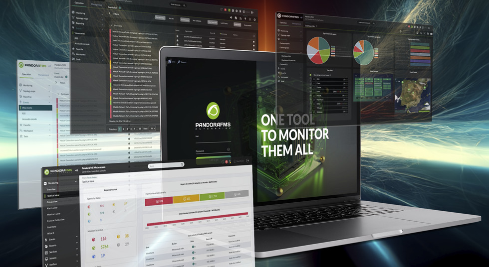
A system monitoring software that has gained lots of popularity in the market and has just launched its new interface.
New Pandora FMS Interface: more accessible and updated
The new interface is a project in continuous development that seeks to enhance the homogenization of all the platform’s visual elements.
More accessible to new and old users and also more modern and dynamic to the perception of the market, where it rivals large competitors.
One of the biggest goals in the project has been to reduce the time and effort required by average users to learn how a new feature works.
Pandora FMS should be used at a more smooth and easy level.
The fewer frustrating barriers users find, the greater the preference Pandora FMS will have in the market.
Pandora FMS user interface improvements for a more intuitive monitoring experience
Lighter and fresher color palette
By reducing the visual load and vivid colors, we were able to highlight the important elements of each screen.
Graphs and data have become the protagonists by keeping a palette reserved for them.
Actions such as buttons, selectors, and forms are clearer and simpler.
Quick eye scanning is more effective at finding the things you need.
Unified iconography
Icons have been redesigned from the ground up to share the same graphic line of colors, line thickness, sizes according to their usefulness, and visual style.
But most importantly, each icon has been reviewed to make sure that the design is as clear and distinctive as possible, and that it really represents the context or idea you want to convey.
We have standardized our icons so that they are easily recognizable even if you have never worked with a monitoring tool.
Homogeneous content structure
We have implemented an organizational criterion that stays the same no matter what type of screen you use.
This would greatly reduce the learning times of the platform since you do not have to “learn” to use each individual screen.
The goal is that users, after seeing the basic forms from the beginning or interacting with the first data tables, can instinctively use all the other features because they are presented in the same way.
You will also be able to identify what type of screen you are on without having to detail the content, preventing you from getting lost within the platform.
With the new structure we have also changed the side menu
We divided the sections according to their group and modernized the way you navigate between screens.
All of this in order for each user to have the links they really use, removing visual overcrowding from the screen.
That extra touch that goes beyond
The new interface will also begin to implement life quality for users.
Transitions between screens or states are implemented, Copy UI and Content UX principles are applied to humanize the tool and speak less archaic jargon, graphic elements are added as illustrations that best explain an abstract concept, etc.
Conclusions
Pandora FMS has managed to create a new interface that is not only effective, but also accessible, modern and easy to use.
You no longer have to worry about spending hours learning how a new platform works or trying to decipher complicated data and charts.
With Pandora FMS, you’ll have everything you need in one place, presented in a clear, homogeneous and easy-to-understand way.
Pandora FMS’s editorial team is made up of a group of writers and IT professionals with one thing in common: their passion for computer system monitoring. Pandora FMS’s editorial team is made up of a group of writers and IT professionals with one thing in common: their passion for computer system monitoring.