Visual Consoles
Introduction
Pandora FMS allows you to build visual maps where each user defines their own way of visually representing monitoring. The visual console editor allows the user, by dragging elements with the mouse, to visually design the final appearance, choosing the background and the icons that represent the state of each relevant aspect that they want to display.
Pandora FMS includes a series of default icons, but users may easily customize their own. Different visual consoles can interact with each other, hierarchically visualizing the status of maps that are “below” on a superior map, thus being able to conceptualize monitoring, and display at a high level a whole series of items.
Creating and accessing visual consoles
To work with a visual map go to Operation → Topology maps → Visual console → Visual console list. On the list you may edit a map, delete it or copy an existing one and then modify it. To create a new map, click Create.
For large environments, where there are multiple visual consoles, filtering was created through free text search, by group and with recursion of secondary groups and subgroups.
Those maps whose name begins with any of the characters _ , [ ( will be displayed in the left menu in the submenu of the Visual Console. This allows you to create a kind of quick view from the menu, keep this in mind when naming the visual console.
Creating a visual console
When creating a new visual console you will access the main view (Main data) and just above it you will see the editor icons. The editor organization is made up of several tabs:
- Full screen mode: Access to the full screen view.
- View: The default view tab.
- Wizard: Wizard to add elements.
- Services wizard: Wizard to add services.
- List of elements: A list of elements contained in the visual console.
- Main data: It contains the general data of the visual console, here you may change the name, among other elements.
- Show link to public Visual Console: Link to share the visual console with a third party through a URL.
- List of visual consoles: A link to return to the list of visual consoles created.
Version 770 or later.
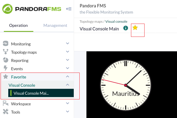
Using the favorite system you may add the visual consoles that you need to have at a glance after logging into PFMS Web Console.
Editing a visual console: maintenance mode
From the menu Operation → Topology maps → Visual console you will access the full list of visual consoles created. You may search by keyword in the Search text box and filter by groups in Group (including subgroups if you activate Group Recursion), to see the result click Search.
To edit a visual console, click on the corresponding name in the Map name column. For more details, see “Creacion and editing of visual consoles”.
Version 766 or later.
Starting with version 766, it has the Maintenance Mode option. Activating this option (Maintenance button) will stop the viewing and editing by other users, even for public URLs of said visual console and in the mobile version of the Web Console to which it belongs.
However, if a user has editing rights to a visual console in maintenance mode, they will have a different notice indicating who activated said mode and the estimated time it will be available again. If the user clicks OK they can deactivate the maintenance mode.
Maintenance mode also works on Metaconsole and Node.
Creation - General data
In this Main data section you may edit and create the basic data of the visual console. It will be the only one visible to a new map until it is saved. The basic values it contains are: name of the visual console, the group for ACL management and the background image, which can be resized regardless of the size of the image. The background color is important, because if the screen where the visual console is displayed is larger than the background image, it will fill in the rest with the background color selected here.
Background images are located in Pandora FMS Console directory, within the directory:
./images/console/backgrounds/
You may upload your own images there through the file manager integrated into Pandora FMS (Management → Admin tools → File manager).
Access permissions in the visual console
ACLs on visual consoles imply that anyone who has read access to a visual console, because they have access to the group with the Visual Console (VR) view flag, will see all the content of the VC, even if there are elements from another cluster.
You may only assign a group to which the user who is creating the Visual Console belongs, unless that user explicitly belongs to the ALL group (ALL).
Creation - Wizard
The wizard allows you to add elements to the visual console quickly and comfortably. You can create elements of various types, and it is recommended that before creating many elements you use it with only a couple of them, to speed up the deletion of elements later, if applicable. If you get something wrong, you may find it faster to clear the entire visual console.
The most relevant element is the one that allows you to create an element per Agent or, on the contrary, create an element per Module. That way you may add dozens of elements that represent a complete Agent, or an element of an Agent, or show all the modules of different agents, creating many elements at once. These can be identified by the Agent name, the Module name, or both.
The most practical solution is to try a few elements and see how it works.
Creation - Services Wizard
The services wizard tab contains a small form to create several service elements at once with a few clicks. The selected services will appear in the visual console automatically with the chosen icon.
Creation - list of items
This tab provides a row-tabulated form of the elements contained in the visual console you are editing. It is a quick way to edit different elements, as well as being a useful tool for users who need to fine-tune certain element values.
The actions allowed in this form are editing (but not changing the element type) and deleting elements (but not creating them). This action must be carried out in the Editor tab. Each row on this screen will be a visual console element.
Visual console creation and edition
From the list of created visual consoles you may edit one of them by clicking on its name. At the top right there is a button that allows you to edit the selected visual console, and duplicate or delete it with two corresponding icons.
This section contains most of the features of the visual console editor, and this is where the elements that make up a visual console can be added and modified (except the image background).
Since version 774, multiple elements can be selected with the help of a computer mouse and keyboard: pressing and holding the CTRL key, left-clicking, and dragging the mouse pointer over the elements to select them. You may also select each item, one by one, by pressing and holding CTRL while clicking the left mouse button on each item.
Once these elements are selected, the following actions can be performed:
- Delete them (Delete Item icon).
- Copy them (Copy Item icon).
- Move them.
- Resize (bottom right border of any selected element, click and drag).
At the top left are the different elements that can be included in a visual console (from left to right):
- Static image : Insert a static image.
- Percentile item: Insert a progress bar or progress circle.
- Module Graph: Insert a Module Graph.
- Basic Chart.
- Serialized pie graph: Insert a circular serial graph.
- Bars graph: Insert a bar graph.
- Event history graph: Insert an event histogram (AutoSLA).
- Simple value: Insert raw data, simple value.
- Label: Insert a text label.
- Icon: Insert an icon.
- Clock: Insert a clock object.
- Group: Insert a group.
- Box: Insert a box.
- Line: Insert a line.
- Color cloud: Insert a colored cloud to an Agent Module.
- Network Link: Insert a network link.
- Odometer: Insert a graphic meter for either percentages or absolute values (calculated as percentages according to established or actually recorded maximums and minimums).
- Service: Insert a service.
Elements that a map may contain
Items share common elements grouped into two tabs: Label settings and General settings. Some, such as Network link do not have these tabs, others such as Color Cloud only have the general settings tab.
Static image
This element displays a static image that will be displayed in four possible colors:
- Red, for critical status (
CRITICAL). - Green, for normal status (
OK). - Yellow, for warning status (
WARNING). - Grey, for unknown status.
Depending on the status of the module, agent or map, one image or another is displayed. In a normal Pandora FMS installation, these images must be in:
./images/console/icons
And these files use a special nomenclature for these images: <image_name>_<state>.png where the state can be:
- Bad: When the Agent has a Module in failure, either the module is in failure or the visual console that it links to contains some element in failure.
- Ok: When the Agent, Module or the visual console that can be linked are correct.
- Warning: When the Agent has some Module in warning, or the Module is in warning or the visual console that it links contains some element in warning.
- (Without any text): When the Agent, module or the visual console that it links does not have any state.
Version 763 or later: When this item has an alert triggered, it will display an orange box that can be disabled in the visual configuration.
Progress
Progress items (Item Percentile) allow you to see the status of a Module in a very graphic and descriptive way. They can be progress bar, ball, donut graph or full donut.
- Max value: It is the maximum value that the Module to be represented may have.
- Type: The type will allow you to define the way the element is represented graphically (bar, bubble, circular or circular with internal ring -donut-).
- Value to show: It shows the value in percentage or the value itself.
- Linked visual console: By default it links to the Data Source Module, but you may change its behavior and link it to any other visual console.
Graph of a module
It shows a graph in real time. It can be a graph of an ordinary Data Module, a combined graph, or one of the graphs that obtain their value in tabular form, which can be of several types.
In the graph it is necessary to define the width and height; That's why it goes from being hidden in the advanced options to being shown.
- Interval: Range of data that the graph will show from the current moment backwards; for example: 1 day.
- Size: Width and height of the image that the graph and the axis figures will occupy on the screen.
- Background color: White, black or transparent. This allows it to be better visually adjusted to the visual console.
- Type: It allows you to choose the type: module graph, combined graph or tabulated graph.
- Agent/Module: In the case of having chosen a graph associated with a data series.
Charts are not previewed in edit mode, so a white box is displayed instead.
- With the Slice mode option you may group by hours (one hour, default value) and choose options to display as maximum, minimum, average and sum with vertical bar, line or area graphs.
Basic Chart
It allows you to choose an agent and a module, with a time period (by default one hour). It can be linked with another related visual console.
Serialized pie and bar charts
These two visual console elements allow you to incorporate complex pie charts or vertical or horizontal bars into a visual console. Unlike a combined “Pie” or “Bar” type chart, these serialized charts incorporate data from a single module, with a special format.
You may only incorporate data from a Module of type “Text” (string) that contains data series with the format tag,value:
tag1,value1
tag2,value2
tag3,value3
tag4,value4
tag5,value5
tag6,value6
Up to a maximum of six elements. To create a Module with this data, it is recommended to do so with an Agent plugin.
Event Histogram/AutoSLA
It displays a horizontal bar, similar to the one in the main Agent view, showing, for an Agent or an Agent/Module combination, the events that took place in the last 24 hours.
Service
It allows you to represent (and provide a link) to the current state of a service, also indicating the percentage of SLA compliance in real time.
If you wish to customize the images in the Visual Consoles, four different images are needed, one for each state, using a special nomenclature for these images: <image_name>_<state>.png where the state can be:
- < image_name >_bad.png
- < image_name >_ok.png
- < image_name >_warning.png
- < image_name >.png (no state)
Text label
To create a text label without associated content, this type of item can be used. It contains text and HTML code (which can create an internal link or other advanced options).
Group
It is a static image that represents the state of a group.
If you want to customize the images in the Visual Consoles, four different images are needed, one for each state, using a special nomenclature for these images: <image_name>_<state>.png where the state can be:
- < image_name >_bad.png
- < image_name >_ok.png
- < image_name >_warning.png
- < image_name >.png (no state)
(Version 763 or later) When this item has an alert triggered, it will display an orange box that can be disabled in the visual configuration.
Boxes and lines
It allows you to add boxes of different colors and shapes to organize and improve the appearance of your visual console.
In the case of lines, when adding them to the visual console, they can be anchored to other elements by dragging one of their tips to the desired element and releasing it. That way the anchored lines will move if said elements are moved.
Simple value
This item allows the value of a Module to be displayed in the visual console in real time. You just need to define a tag (optional), and choose the Agent and Module. To replace the value use the macro ( _VALUE_ ).
(Version 763 or later) When this item has an alert triggered, it will display an orange box that can be disabled in the visual configuration.
Icon
It is very similar to the static image, but the selected icon will always appear gray, as if it were in an unknown state. Icons that do not have state information are often used, that is, they cannot be used as a static image, but can be used as an icon. A simple image, like a logo, for example.
Icons linking other pages
In the dialog box it is possible to link an icon to another visual console.
If you want to customize the images in the Visual Consoles, four different images are needed, one for each state, using a special nomenclature for these images: <image_name>_<state>.png where the state can be:
- < image_name >_bad.png
- < image_name >_ok.png
- < image_name >_warning.png
- < image_name >.png (no state)
Also using the label field (Label settings) and entering a complete URL address, the icon can be linked to a web page. For example, to link a visual map icon with the SNMP console viewer, an icon type element must be created that has the complete address of the viewer as a label field:
http://<pandora_home>/index.php?sec=snmpconsole&sec2=operation/snmpconsole/snmp_view
(Version 763 or later) When this item has an alert triggered, it will display an orange box that can be disabled in the visual configuration.
Watches
This item allows you to add a dynamic clock, both analog and digital, from any time zone to your visual console, showing and updating the exact time (and date) at all times without having to refresh the page.
Heatmap
This element allows you to represent blurred clouds of color that depend on the value of the assigned Module; often referred to as “heat maps.” Through settings you may create ranges of values (for now only numeric). Each range must be consistent with the next and each is added with the “ + ” icon.
When the value of the selected module is between the values (including limits) of a range, the color chosen from that range will be used for the element. If no range is met, the default color will be used.
Network link
![]() Two items (static image elements) that have been configured using Agents with Modules for network interface of type
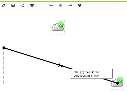
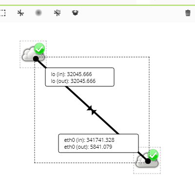
Two items (static image elements) that have been configured using Agents with Modules for network interface of type <prefix>ifOperStatus can be linked through a Network Link. To do this, add a static image, indicate an Agent and select a Module.
Next add a Network link and “drag” one of its ends to one of the previously configured static images:
To finish “drag” the other end to the second static image:
The three elements will be joined and when you move one of them they will be moved together. By double clicking on the Network link you will be able to see the two graphs and perform the operations inherent to them.
It is recommended to modify the modules and place units, if applicable, since these will reflect this change in the Visual Console.
Odometer
It allows you to select an Agent and then one of its Modules, which is numerical. It has two types of operation: absolute values or percentage values. The percentage will be used only if it has the percentage symbol as units, and has a minimum and maximum defined (100). In that case, the percentage is shown as the value, otherwise the absolute value of the module is shown. Although the odometer represents it as a percentage on the graph.
It takes the maximum and minimum defined, if it is not defined, it takes the maximum and minimum of the last two days. If it has thresholds, it will be displayed according to its status, normal (green), warning (yellow) or critical (red). If there are no thresholds, it will always appear green.
Advanced options for each element
- Position: By default, the position is 0x0, where the first figure is the X axis and the second is the Y axis. These values are in pixels; Note that the axis is defined so that the Y axis is inverted, where the top is 0 and grows downwards, and the X axis is defined in the classic way, that is, it starts at the left edge and grows to the right. This position is automatically modified when you click and drag an element.
- Parent: To represent the relationship between elements of the visual console, lines are used that are drawn between them. Gives the line itself a color based on the state of the parent element.
- Associated map: Different elements can be used to “summarize” the state of another visual console. That way, the icon status (Green, Yellow, or Red) is displayed using the status of the linked console. Additionally, it is possible to activate a link from the element to the visual console.
- Restricted access for group: If one is selected, the display of this element in the visual console will be restricted to those users who do not have read permissions on the group in question. It will also be taken into account when calculating the state weight in a linked console; It will only be calculated on elements that the user can see.
Ways to calculate the status of the linked visual console
- “By default” calculates the state from the state of all elements, as an agent would do.
- “By weight” calculates the status of the elements that have a visual console, module or agent assigned to them in relation to a percentage of elements configured by the user. This percentage is what the number of elements of a non-normal state has to exceed with respect to the number of elements taken into account in the calculation for that state to change.
- “By critical elements” calculates the status using the elements in critical status and the percentages of the user-defined thresholds. If the number of elements in critical status, compared to the number of elements taken into account in the calculation, exceeds the percentage assigned as warning, the status becomes warning. The same for the percentage assigned as critical, which also has preference.
Share a visual console
It is possible to share a visual map with anyone, even if they do not have a username/password to enter Pandora FMS. From the console view, access the Show link to public Visual Console tab.
This special URL is static and looks like this:
http://192.168.50.2/operation/visual_console/public_console.php?hash=86d1d0e9b6f41c2e3e04c5a6ad37136b&id_layout=3&id_user=admin2
The user will not be able to access any of the links or information of any agent from there; only to the information published in the visual console.
Export and import visual consoles
- Export visual console: This is done from the menu Management → Resources → Resource exporting → Visual console, from where you choose the visual console to export and click Export to the right. This option generates
.ptrfiles (internally in XML format), only with the visual console itself, without agents, data, background image, etc. - Import visual console: A policy can be imported from a
.ptrfile from the Management → Resources → Resource registration menu by selecting thefile. ptr(in this case it is unnecessary to use Group filter) and clicking Upload.
Macros in visual consoles
When entering a macro in the text box, this macro will be replaced by the data obtained from the feature of that macro:
_date_: It displays the date using the local PHP format._time_: It displays the time using the local PHP format._agent_: It shows the alias of the selected agent._module_: It shows the name of the selected module._agentdescription_: It displays the description of the selected agent._address_: It shows the IP address of the selected agent._moduledescription_: It displays the description of the selected module.
Full screen display
In the visual consoles there is the option to allow automatic refresh and the option to show a QR code of your web link. You may activate the “full screen” mode in your web browser (usually with the F11 key) to the visual console; At the top right you will find the button to display the QR code with the URL of the visual console and a drop-down list to change the update frequency (by default every five minutes).
Favorite visual consoles
The favorite visual consoles options allow you to have shortcuts from the menu bar or access a list of visual consoles checked as favorites.
To check a visual console as a favorite, check the Favorite visual console checkbox when creating or editing its main editing section.
![]() In the Enterprise version you may also set the visual console to auto-adjust its size if it is displayed in full screen.
In the Enterprise version you may also set the visual console to auto-adjust its size if it is displayed in full screen.
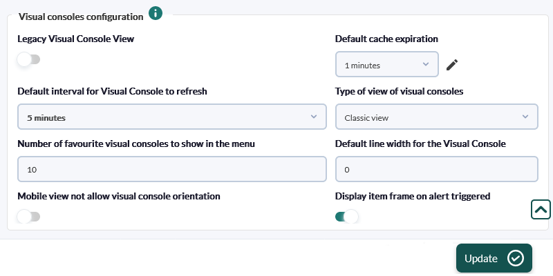
To modify the favorite visual console options we must access the **Management** → **Setup** → **Setup **→ **Visual Styles** section in the side menu bar.
Visual Console Templates
In order to create a new template, choose a created visual console, a representative name and the group, and a new template will be created. In this section, you may also see the visual console templates created, if any.
Visual Console Wizard
The visual console template wizard is used to use a previously created template to apply to a new visual console. Choose the agents to which you want to apply the selected template. As many visual consoles will be created as agents have been chosen.
Once the template has been created, if you want to make any changes, make them in the chosen visual console and recreate the template.
Once the selected template is applied, it will create the visual consoles, which will appear in the list. If the template is created through a favorite visual console, all visual consoles created from this template will also be favorites.
In order to make the use of templates more dynamic, in the labels of the elements of the visual consoles you may add macros _agent_ and _agentalias_, replacing these with the name and alias of the Agent.


 Home
Home

