Dashboard
Introduction
The Dashboard is a Pandora FMS functionality that allows each user to build their own monitoring page. More than one page can be added, and monitoring maps, graphs and status summaries, among other elements, can be added.
The building blocks of the dashboards are called graphical widgets (or simply widgets ).
To configure or view a dashboard, access the section Operation → Reporting → Dashboard → Dashboard → Dashboard list. When entering this section, a list will appear with the dashboards to which the user has permissions to access, as well as the option to create new ones.
Pandora FMS simplifies monitoring management through user permissions. There are several permission systems that restrict what a user can see or manage, the most important is the concept of groups (either predefined groups by Pandora FMS and/or customized groups) combined with the profile of each user. Pay special attention to the notes about the All group (ALL) throughout the documentation.
Migration to the new dashboard system
From version 745 onwards, a new dashboard system comes into operation in Pandora FMS.
If there are already any dashboards created in your system there will be no need of performing any additional configurations, as the migration to the new system will be done automatically. However, you will need to relocate and resize the corresponding widgets.
In some cases, the contents of some widgets cannot be migrated, so you must delete and create again the widgets.
Creating a Dashboard
To create a Dashboard, go to Operation → Reporting → Dashboard → Dashboard list → New dashboard.
By default the Dashboard will have only one cell and you should indicate if it will be private (only the user that has created it and the Pandora FMS administrator will be able to see it) or visible to a group. You will only be able to assign a group to which the user that is creating the dashboard belongs to, unless this user explicitly belongs to the group ALL .
The Date range button is disabled by default and enabling it allows you to add a date range or a standard time period by clicking on the List icon (last 24 hours, this week, etc.) for the widgets you add to the Dashboard: Basic chart, Block Histogram, Data matrix, Custom graph, Graph module histogram, NetFlow, Security Hardening, Agent module graph (Single graph), SLA percent and Top N. Although each widget displays its own date range value, it will actually use the one set in the Dashboard configuration.
If you have checked the Favourite option, a shortcut to the newly created Dashboard will be added to the menu when the page is reloaded.
To edit the Dashboard click on the edit button to the right of the row of icons, then to add cells click on the circle icon with +.

Click on Add widget, a new window will be displayed with all the types of objects that can be added. Using the buttons at the top left you can navigate between the different pages and see all the available widgets.
You can modify the Dashboard again (name, private, users, favorite): click on the icon next to the add cells button. You can also select other dashboards from the drop-down list right next to it and repeat the procedures for modifying and adding widgets.
NG 770 version or later.
Independently of the Favourite field in the general settings of a dashboard, it can also be added to the favorites system by clicking on the star button next to the name. To remove it from the favorites system, click it again and uncheck it.
Adding widgets to the Dashboard
Welcome message to Pandora FMS
Widgets have some common fields such as title, group, background color, etc. There is a Welcome Widget (Welcome message to Pandora FMS): type “Welcome”, select and add, edit and remove it until you feel familiar with the tool.
Agent/Module View
Used to display a list of selected agents and their modules.
- By default it takes the group that was assigned to the Dashboard that the Widget belongs to however in principle you can select any agent from any group. By selecting any other group, the list of agents will be deleted. The Widget accepts to be configured without any agent but it will not show any message about it if it is saved as such.
- In case there are subgroup(s) of the chosen group, when selecting recursion, agents will be included in such subgroup(s).
- Show common modules: Displays the modules common to the selected agents or displays all modules of the selected agents. You can also filter further by choosing an element from Module group.
- For the information displayed for each module you can choose between status or value.
Triggered alerts report
Used to display a report of triggered alerts to be validated. It is configured with the group from which to obtain the triggered alerts and optionally the recursivity to search also in subgroups of the selected group.
Clock
Displays a clock with the time set in the Console. You can choose between analog or digital clock and set a background color.
Defined custom graph
You can choose between the graphs created by users in Pandora FMS (Operation → Reporting → Custom graph) and even change the graph type to one different from the one previously defined.
If Date Range button is enabled in the Dashboard settings, although it displays its own interval it will actually use the time period set in Date range.
List of latest events
This widget can consume a lot of machine resources.
- Limit the search to specific groups (All by default).
- Reduce the number of hours to the minimum necessary (8 by default).
It allows to add a list with the last events occurred in Pandora FMS. The saved filters can be used previously and the values of the fields that are common to both will be taken. If the selected filter is modified later those changes will be reflected in the widget. To stop using the filter select “None” and save the changes in the widget.
The columns to be displayed can be configured, adding or removing elements, as well as the order.
Module histogram
Displays a graph of the module's status history.
- Periodicity: Value between 1 and 48 hours.
- If the Date Range button is enabled in the Dashboard configuration, although it displays its own interval it will actually use the time period set in Date range.
Top N events by module
Displays the graph of the most important list of events per module according to the group.
- Amount to show: Number of event types.
- Max. hours old: Time (in hours) in which existing events will be taken into account for display.
General group status
Displays a status of the chosen group, indicating the total number of Agents and Modules in that group, as well as a count organized by their status.
In the configuration window you can configure the group to be displayed. If you select the All group all groups will be displayed, if you select a group you have the option of Group recursion to recursively display the subgroups of the selected group. Once the widget is created you can access the corresponding group by clicking on its name.
Tree view
The default tree view will be displayed. If configured:
- Open all groups: If checked, the tree will be displayed with its branches expanded as selected (Groups, Module groups, OS, Policies, Tags).
- Agents status: To filter by Agent status or by triggered alert.
- Modules status: To filter by Module status or by triggered alert.
- In the node it is possible to filter by both Agent status and Module status with the Not Normal condition which includes Warning and Critical statuses at the same time.
- In the Command Center (Metaconsole) you can only filter by Not normal status in Agents.
Visual Console
- This version is only supported on desktop versions.
- The maps must be previously created in Operation → Topology maps → Visual console.
Choose a map from those that have been created and wait a few moments. It must be sized to the appropriate size for the screen size where the visual map will be displayed.
General visual maps report
Allows you to select one or more Visual Consoles.
- The maps must be previously created in Operation → Topology maps → Visual console.
This list will represent with a green rectangle (OK) if everything in the console is in normal state, if one of the modules is in any of the other possible states, it will be represented in red (BAD). If the visual console does not have any agent and/or module configured, it will also be represented in red (BAD). Clicking on the map name will take you directly to the Visual Console.
Show icon and module value
The Icon and module value widget is available to display the module value and an icon:
- Agent: Agent used to obtain the module list of the selected one.
- Module: Module used to obtain the data to be shown.
Show module status
The Module status widget is used to display the module value:
- Agent: Agent used to obtain the module list of the selected one.
- Module: Module used to obtain status for the image.
- Icon: Icon shown in the widget that reflects changes in module status.
See URL content
To add the content of a URL in Pandora FMS you must add the URL content widget.
Bear in mind that the website must match the size of the cell that hosts the widget or have responsive web design technology. Likewise, pay attention to the iFrame or boxes you have and in addition the possible links that use HTTP instead of HTTPS (encrypted content).
Show the module value as a chart
Widget Module in a table:
The setting options it shows are:
- Agent: Agent chosen to obtain the module list of the selected one.
- Module: Module used to obtain the data to be shown.
- Data separator: Separator to generate different lines. Possible options are: carriage return, vertical bar, semi-colon, colon, comma, space.
Show module value
System status
Widget Global health info:
This widget has no major configuration, just adjust its location, size and color according to the Dashboard composition.
Network Map
This type of element is not compatible with another network map or with a services map in the same dashboard.
Network map:
- Map: Choose one of the registered maps from the list (menu Operation → Topology maps → Network map).
- Zoom level: Focus level on the Network Map.
Message panel
Custom reports
To add registered user reports (Custom report) in Pandora FMS :
Report: Escoja el informe, el cual debe estar creado previamente, y que contendrá el widget. Pulse Update.
Showing a service map
This type of element is incompatible with another service map or with a network map in the same dashboard.
To display a Service Map use the Service map widget:
- Service: Service to be shows. It must have been previously created in the service section.
- Enable sunburst: Allows you to enable a view that diverges from a central point.
Agent module graph
Widget Agent module graph:
- Agent: Combo where the agent is chosen.
- Module: Combo where the agent module selected in the previous point is chosen.
- Periodicity: Combo where the graph time period is set. If the Date Range button is enabled in the Dashboard configuration, although it displays its own interval it will actually use the time period set in Date range.
- Sliced mode: It displays the information grouped by time (1 hour by default), with the option of displaying the maximum, minimum, average and sum (Maximum, Minimum, Average, Summation) in Area, Line or Verticals bars mode. To use this mode, activate the Sliced mode button and save the widget. Once the information has been refreshed, it can be edited again and the corresponding options can be chosen as needed.
If the Projection Graph option is enabled, it will always override Sliced mode.
Show module SLA percentage
Widget SLA percentage:
- Agent: Agent used to obtain the module list of the selected one.
- Module: Module that will provide the data for the selected module status history graph.
- If the Date Range button is enabled in the Dashboard configuration, although it displays its own interval it will actually use the time period set in Date range.
Group Status
The Groups status widget displays a table with the statuses of the selected groups.
To view all groups select only the All group and activate the Group recursion button.
Tactical View
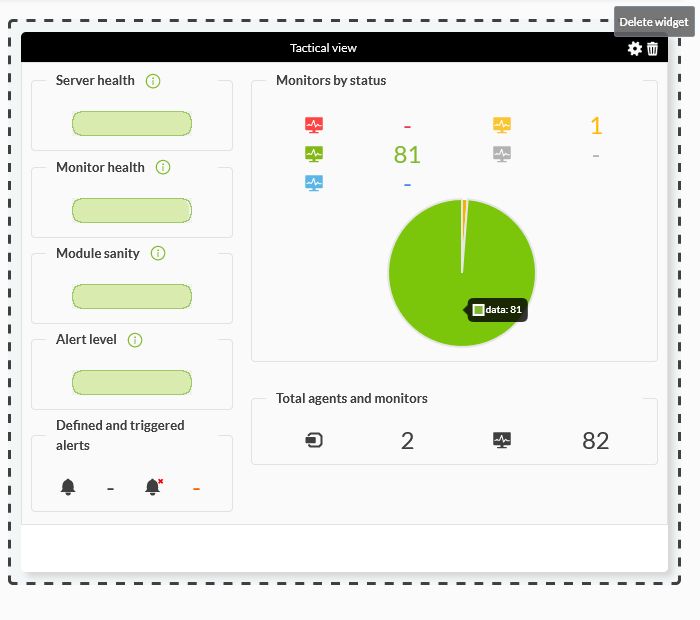
To add a report with the status of Pandora FMS monitors, insert the Tactical view widget:
You can add one or more groups to the selection and to obtain a display at least one of the following parameters must be chosen:
- Status and Monitor Checks.
- Server Performance.
- Summary.
Top Number of events per agent groups
Widget Top N events by agent:
- Amount to show: Amount of agents.
- Max. hours old: Time during which existing events shown will be taken into account.
- Groups: Agent groups to be included.
Top N modules
Widget Top N of agent modules:
- Agent: Agents to include through a regular expression (regex).
- Module: Modules to be included through a regular expression.
- Period: Data period that will be used to show the widget's information.
- Quantity (n): Amount of modules shown.
- Order: Way to organize elements, either ascending, descending, or even by agent name.
- Display: List to be shown by minimum, maximum or average.
- If the Date Range button is enabled in the Dashboard configuration, although it displays its own interval it will actually use the time period set in Date range.
Show agent WUX transaction
Widget Agent WUX transaction shows a selected WUX transaction:
- Agent: Choose the agent that has the WUX monitoring to be shown.
- WUX Transaction: Choose the WUX module to show.
Show agent WUX transaction statistics
The WUX transaction stats widget displays statistics of selected WUX transactions:
To take advantage of this resource, first enable the Run performance tests option in the WUX module and indicate a target website. Example:
- Agent: Choose the agent that has WUX monitoring to show.
- WUX Transaction: Choose the WUX module to be shown.
Services view
Widget Services view allows to display the services registered in the PFMS server.
It can be configured in tree mode (default) and in table mode.
OS Quick Report
763 version or later.
OS Quick Report sorted by operating systems (OS Quick Report) used by registered agents.
It has no configuration and depending on the group the user belongs to, they will be able to see a variable number of agents. At the same time, a summary of the status of these agents is shown: number of Normal agents, Critical agents and Unknown agents.
Color tabs modules
NG 764 version or later.
The Color tabs module allows multiple selection of agents and modules. It displays the selected modules in the form of tabs or tabs in which the content will be alias of the agent data and unit.
To configure it, choose in the text box Agents the agents to be displayed (or select all of them in the corresponding selector All).
Once you have selected the agent(s), select the type of module selection (Type), either all modules (Show all modules) or only the modules that the selected agents share in common. Then the modules (Modules) will appear and you will be able to add them all with the respective All selector and delete them in their corresponding close button for each module. You will be able to format the data (Format Data) and in Label select whether to show agent name, module or both.
Block histogram
NG 764 version or later.
Block histogram allows multiple agent and module selection. It shows the selected modules in the form of blocks identified with the agent name and/or module name. To configure it, choose in the text box Agents the agents to be displayed (or select all of them in the corresponding selector All).
Once you have selected the agent(s), select the type of module selection (Type), either all modules (Show all modules) or only the modules that the selected agents share in common. Then the modules (Modules) will appear and you will be able to add all of them with the corresponding All selector and delete them in their corresponding close button for each module. You will be able to format the data (Format Data) and in Label select the name of the agent, module or agent and module to be shown.
If the Date Range button is enabled in the Dashboard configuration, although it displays its own interval it will actually use the time period set in Date range.
Grouped meter graphs
NG 766 version or later.
The Grouped meter graphs widget displays, according to their size, a series of squares representing their threshold: the larger the space, the higher the number of squares. It is also possible to choose a custom threshold for graphical representation only.
It shares common features with other widgets such as title, group, background color, and so on:
- Format data: Formatting of the result, e.g.
1000→1K. - Values: It cuts values at the top and at the bottom.
- Manual thresholds: By default it takes the values dynamically, those assigned to the modules themselves, but you may also add a specific threshold for all modules.
- Modules: It allows you to select the modules of the selected agents.
- String modules are excluded for this widget.
- The widget is limited to a maximum of twenty items.
- It also works in the Command Center (Metaconsole).
Data matrix
NG 768 version or later.
Widget Data Matrix displays the information of the requested modules in an uncompressed form taking into account the value of the requested interval.
- Format data: If the data returned by the module is to be formatted, value: active by default.
- Limit: Number of rows to display in the table.
- Type: Show all modules or, if two or more modules have been selected, show the modules in common.
- Modules: Agent and module selector.
- All: Button for quick selection of all modules.
- If the Date Range button is enabled in the Dashboard configuration, although it displays its own interval it will actually use the time period set in Date range.
- It also works in Command Center (Metaconsole).
Event cardboard
NG 770 version or later.
The Event cardboard widget presents a count of events grouped by criticality, over a period of time and by selected agent groups.
- Event type: It allows you to choose only one type of event, e.g. agent created, alert triggered, etc.
- Max. hours old : By default the events created in the last 8 hours.
- Event status : It allows filtering by event status (All, Pending only or Validated only).
- Severity: Select events by criticality, e.g. Informative, Maintenance, etc.
- It also works in Command Center (Metaconsole).
Avg|Sum|Max|Min Module Data
NG 770 version or later.
It allows displaying the average, maximum or minimum value (AVG, MAX, MIN) of a module or the sum (SUM) of an incremental module, with or without its unit of measurement (Unit) and descriptive label over a period of time (by default the last 30 days).
- Type: Average, sum, maximum or minimum value of a module.
- Time period: By default the last 30 days; the last month, the last 7 days, the current week, the last 24 hours or the current day are also available.
- Unit: If the module has a unit of measurement assigned to it (MB, sessions, bytes/sec, etc.), it will show said unit.
- It also works in the Command Center (Metaconsole).
Modules by status
NG 770 version or later.
The Modules by status widget allows you to display modules by status (critical status by default) grouped by page (five by default). They are ordered by their last status change (Last status change), the most recent first.
- Free search: It allows you to select modules by keyword.
- Status: To select one or more states, the Critical state is selected by default.
- Limit: Results per page, five by default.
- It also works in the Command Center (Metaconsole), at least one node must be selected.
Basic chart
Version 771 or later.
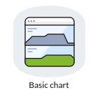
The Basic chart widget allows to visually represent an agent module, changing color according to the status, with the option of displaying the value and choosing a specific time period.
- Interval: Time period to display, by default 1 day. You may also set a custom interval by clicking on the pencil icon.
- Color chart: Chart color. By default it takes the one you have in the visual configuration of the charts in position 1.
- Label: Show name of the agent, module or agent and module (module by default).
- Show label: Show or not the label, it does by default.
- Show value: Show or not the current data, it does by default.
- Format: To format the value, formatted by default.
- Color value: Color of the value font, black by default.
If the module has a threshold and is in any state other than normal (critical, warning, warning, unknown, with triggered alert, etc.) it will show the color of its corresponding state.
Heatmap
The Heatmap widget dynamically displays the module status on a clickable map and provides more information in a pop-up window.
It allows grouping (Type field) by agent groups, modules by module group, modules by tag and module by agent. In the Search text field you can add a search string to limit the results.
Group status map
The Group status map widget allows you to display the number of groups on a map with their corresponding states in each color. It allows adding links to the boxes and clicking on them zooms in, then creates a button to remove that zoom and return to the previous box in hierarchy. It also allows to choose specific agent groups and use recursion if you have subgroups in the chosen group.
Security Hardening
The security hardening widget is only available with the corresponding plugin installed and running.
Common fields
- Title: It allows to place a title, by default Security Hardening.
- Background: It allows to choose a background color.
- Group: It allows to filter the data by agent group (All by default, all groups).
- Date: Only for Data type with Evolution and Scoring by date, it allows to choose a period of time (last 7 days, last month, etc.). To choose these periods, click List, where you may even set a custom time period. When saved and edited again, the widget will show again the start date and end date interface with the values set to the selected period. The None value is not valid for the configuration.
- Data type: It allows to choose the following options:
List of agents with worst score.
With Top-N agents with the worst score, the last scores of the ten agents are displayed (default) and sorted from worst to best score.
List of most frequent failed controls.
In Top-N most frequent failed checks, the last data of all agents and by type of check are grouped and the checks with the highest number of failures among all agents are shown. The number of checks to show, by default, is 10.
List of failed checks by category.
With Top-N checks failed by category, the latest data of all agents (or the selected group) are grouped by categories and the categories with the highest number of failures among all agents are listed.
The number of total categories to be listed is 10 (default value).
Vulnerabilities by category
In Vulnerabilities by category, a category is chosen and failed and passed checks (optionally skipped ones with the token Ignore skipped) of all agents in the selected group will be grouped.
Available categories:
- Access Control Management (selected by default).
- Account Management.
- Application Software Security.
- Audit Log Management.
- Continuous Vulnerability Management.
- Data Protection.
- Data Recovery.
- Email and Web Browser Protections.
- Inventory and Control of Enterprise Assets.
- Inventory and Control of Software Assets.
- Issue Response Management.
- Malware Defenses.
- Network Infrastructure Management.
- Network Monitoring and Defense.
- Secure Configuration of Enterprise Assets and Software.
- Security Awareness and Skills Training.
- Service Provider Management.
Scoring by date.
With Scoring by date, the last scores of the agents of the selected group (or all, All) within the selected time range are displayed.
It always takes the last score of each agent within the time range, i.e. if a range of one month is placed, the last score of the agents within that month will be searched.
The display of items with long history data can have an impact on system performance. We do not recommend using intervals longer than 30 days.
Evolution
In Evolution, a global evolution of Security hardening is shown by averaging the tests that have passed and those that have failed, grouped by day, of all the agents or those within the selected group with the last eleven dates to avoid overflowing the graph. In Command Center (Metaconsole), the average of all the agents of all the nodes is made, they are not separated.
NetFlow
The widget NetFlow allows you to view the data collected by the probes used to collect agent control data.
- To use it you must choose a filter and then a period of time.
- If the Date Range button is activated in theDashboard configuration, although it displays its own interval it will actually use the time period set in Date range.
The possible ways of visualization are as follows:
- Area graph: They show over time (from the source date to the target date), the evolution of the data. The level of precision of the graph must be chosen in the “Resolution” token.
- Circular mesh: Displays an interactive pie chart representing IP connection pairs and traffic volume.
- Data table: Displays a data table with each IP and a number of rows depending on the chosen resolution.
- Detailed host trafic: Displays a map of portions representing traffic by IP.
- Summary: It shows a summary table, a pie and a table with the data of the whole period.
- Top-N connections: A table showing the TOP-N connections between Source IP - Destination IP pairs, based on the traffic between those IP addresses (the sum of the percentages of the N elements of the table not necessarily will be one hundred because there may be other pairs of connections src/dst).
Agent hive
The widget allows you to display the agents belonging to one or more groups (except the All group).
It displays details such as last connection, IP address, operating system icon used (if applicable), among other details.
It also works in the Command Center (Metaconsole).
Inventory
The widget Inventory allows filtering by agent, group and free search (Free search) for a module and available inventory date (by default Last). For each widget you can choose all defined inventory modules or only one in particular. Results can be sorted by agent name.
GIS map
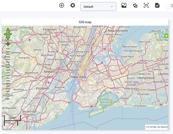
The GIS map widget allows you to choose from a list of registered maps. When clicking on an agent that appears in those maps, it displays detailed information about each one.
Pandora ITSM tickets
To use this widget you must first configure the integration between Pandora FMS and Pandora ITSM.
Once the communication between both systems has been configured, you can have a view of the incidents created and shared, with important information such as priority, owner, last update (among other fields, up to a maximum of nine) of the tickets created and still open.
You can limit the number of items per page (20 by default) and use a previously saved Custom search (Operation → ITSM → Dashboard → Tickets → List → Filter menu).
Placing items on the dashboard
When clicking on the items from the Dashboard it is possible to move them around and place them wherever the user wants.
Editing objects on the dashboard
To edit configuration parameters for a Dashboard item, press on the configuration icon that can be found on the top right corner of the item to edit.
Once clicked on the icon, the settings menu will appear. Modify it and click Update to save the changes.
Deleting objects on the Dashboard
To delete the configured parameters for an item on the dashboard, click on the trashcan icon at the top right of the item you wish to delete.
Dashboard management
Editing a Dashboard
The values of a Dashboard that can be edited are: name, group and number of cells. To modify a Dashboard already created, click on the Options icon. Click on Ok of the item you have modified to save the changes.
Deleting a Dashboard
To delete a Dashboard already created, go to the list of Dashboards and delete the desired Dashboard in its corresponding trash can icon (Delete column).
Slideshow mode
To activate the slideshow mode, go to the top right menu, from the Dashboards section, and select the Dashboards to be displayed in the presentation. The Console will change to slide mode, from where you can control the rotation frequency, among other options.
Full screen mode
To access the full screen mode, click on the icon below:
This simple and intuitive screen and controls resemble those of the slide mode. It allows to set a refresh rate and switch to slideshow mode.
Share Dashboard
To share a Dashboard you only need to click on the following icon, copy the URL and send it to the recipients.


 Home
Home


