Reports
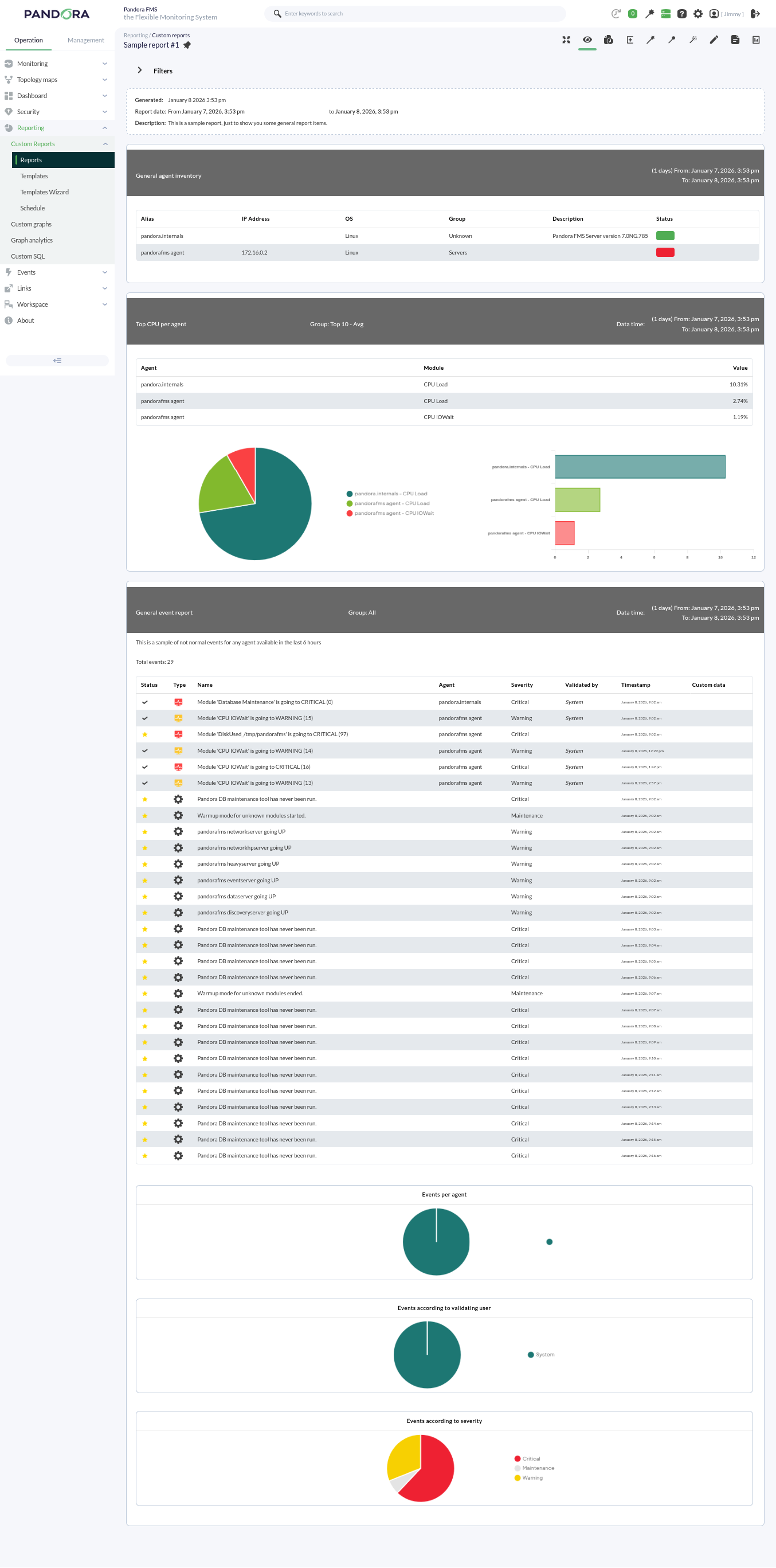
Pandora FMS offers the possibility of visualizing monitored data in an orderly manner within a report. We can generate these reports in different formats, such as HTML or PDF, and they can even be sent by e-mail automatically.
Within a report, data is represented in different ways:
- Simple graph: Shows a graph with the value of a module during a configured time interval.
- Predictive graph: Shows a graph with the expected values for a module during a configured time interval.
- Top N: Shows N values discriminated by maximum, minimum, or average over the total number of modules added, sorted in ascending or descending order, or by agent name.
- Projection graph: Shows a graph presented in two parts:
- On one hand, data referring to a selected module in an existing period of time.
- On the other hand, the estimate for a future time slot based on the previously selected values.
- Custom graph: Shows a graph with the values of different modules that have been configured in the graph.
- Module values: Where average, maximum, or minimum values, etc., can be included.
- S.L.A. graphs: Shows a graph presenting the compliance degree of a module in the configured interval.