Charts
Pandora FMS includes a collection of graphs with which the data collected over a user-defined period of time can be represented.
The graphs offered by Pandora FMS can be divided into two ways of visualizing data:
With data collected during a time threshold
We can find simple graphs generated automatically when receiving data from modules, or custom graphs.
Simple graphs: They show individually a range of data collected in the configured interval.
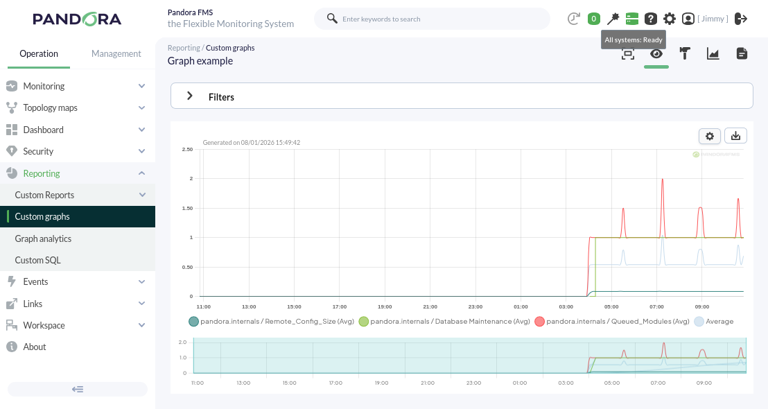
Custom graphs: They show combined information from any modules we want to represent on the same graph with the configured time interval. With this type of graph, we can perform comparisons between modules of different agents. An example of this type of graph can be seen below.
With real-time data
We can individually visualize certain information collected by the console, regarding the status of the server where our Pandora FMS is installed, in real time.
Through this functionality, for example, it is possible to observe the traffic flow of a network interface live.