Data visualization
Views
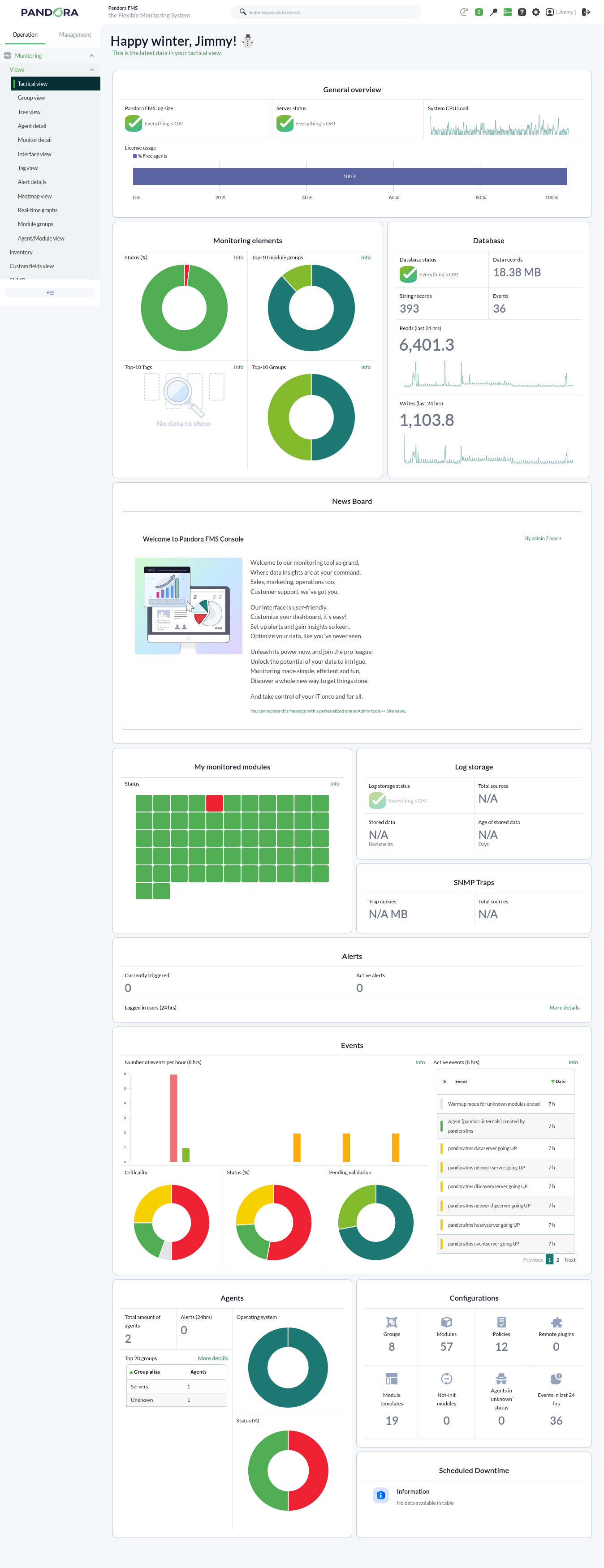
Pandora FMS offers a wide range of possibilities for visualizing the data collected by different monitoring tasks. Pandora FMS has a multitude of views featuring the data gathered by the tool. Below, we can see a routine visualization of the Tactical view:
Charts
Pandora FMS includes a collection of graphs with which the data collected over a user-defined period of time can be represented.
The graphs offered by Pandora FMS can be divided into two ways of visualizing data:
With data collected during a time threshold
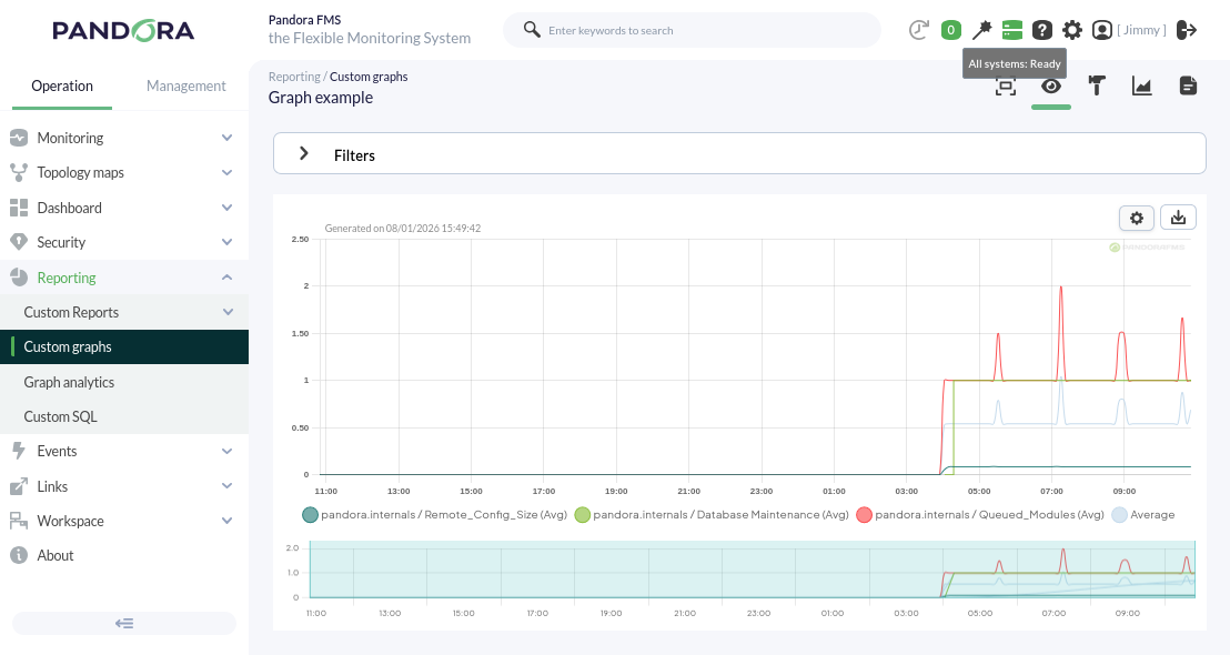
We can find simple graphs generated automatically when receiving data from modules, or custom graphs.
Simple graphs: They show individually a range of data collected in the configured interval.
Custom graphs: They show combined information from any modules we want to represent on the same graph with the configured time interval. With this type of graph, we can perform comparisons between modules of different agents. An example of this type of graph can be seen below.
With real-time data
We can individually visualize certain information collected by the console, regarding the status of the server where our Pandora FMS is installed, in real time.
Through this functionality, for example, it is possible to observe the traffic flow of a network interface live.
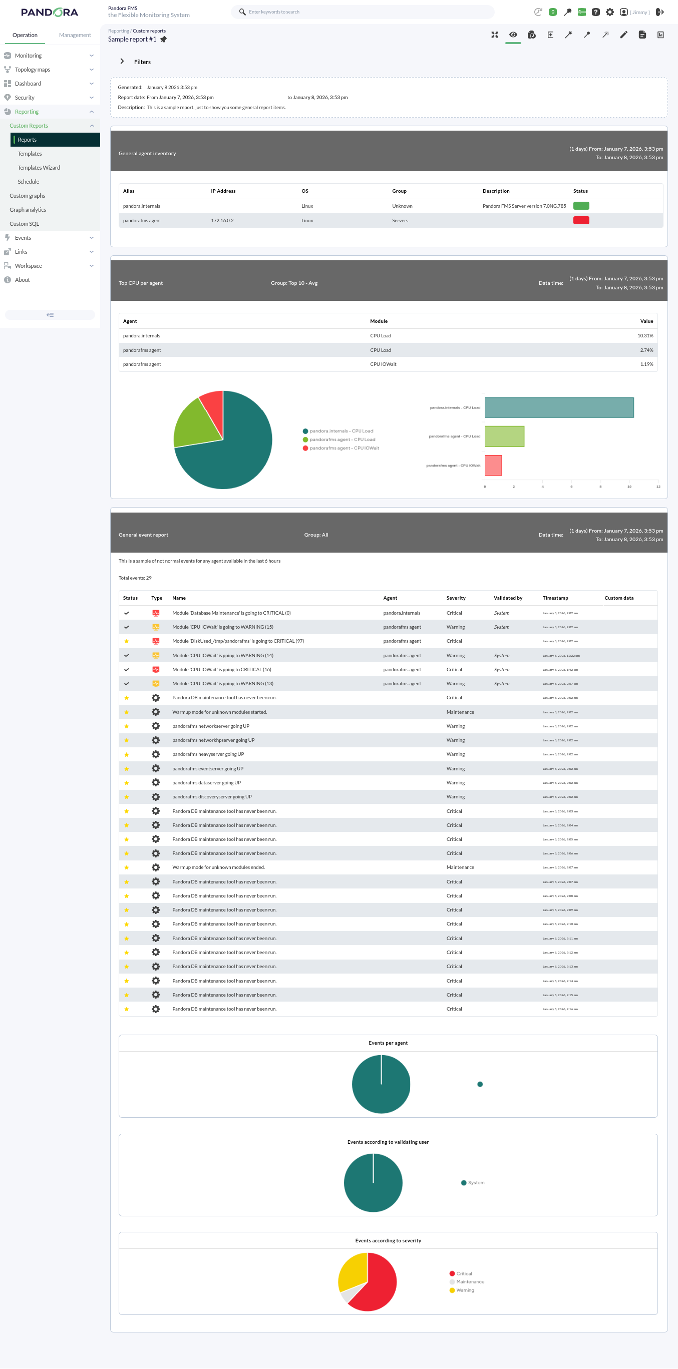
Reports
Pandora FMS offers the possibility of visualizing monitored data in an orderly manner within a report. We can generate these reports in different formats, such as HTML or PDF, and they can even be sent by e-mail automatically.
Within a report, data is represented in different ways:
- Simple graph: Shows a graph with the value of a module during a configured time interval.
- Predictive graph: Shows a graph with the expected values for a module during a configured time interval.
- Top N: Shows N values discriminated by maximum, minimum, or average over the total number of modules added, sorted in ascending or descending order, or by agent name.
- Projection graph: Shows a graph presented in two parts:
- On one hand, data referring to a selected module in an existing period of time.
- On the other hand, the estimate for a future time slot based on the previously selected values.
- Custom graph: Shows a graph with the values of different modules that have been configured in the graph.
- Module values: Where average, maximum, or minimum values, etc., can be included.
- S.L.A. graphs: Shows a graph presenting the compliance degree of a module in the configured interval.
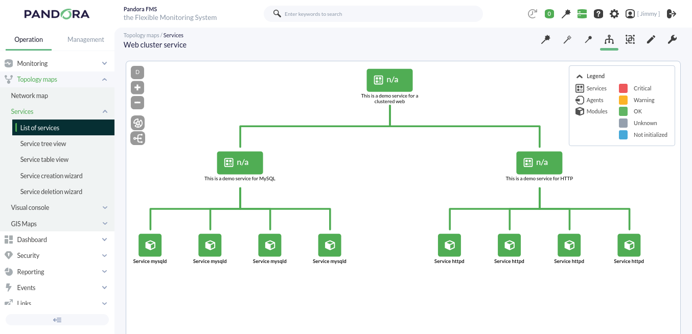
Services
A service is a grouping of resources that form a whole.
Pandora FMS monitors a group of elements whose individual status determines, in a configurable way, the global status of the service provided. For example, Pandora FMS depends on its various functionalities (Web Console, PFMS Server, MySQL database server), where each has a lesser or greater degree of importance for the correct operation of the tool.
Pandora FMS, when in high availability mode, even has a base schema similar to a web cluster:
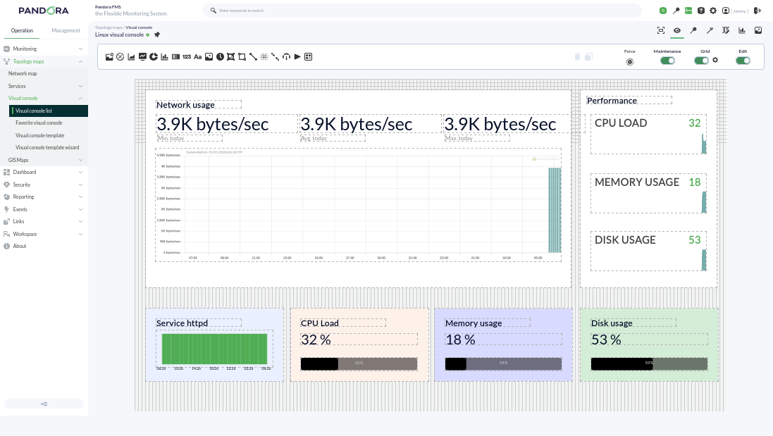
Visual Consoles
Pandora FMS offers the possibility of customizing how the monitoring carried out by the tool is visually represented. Within a Visual Console (Visual Console or simply VC), the following elements can be found:
- Static image: Image associated with a module/agent to view its status.
- Percentile element: In monitoring modules for finite resources (such as RAM, cache memory, etc.), where the resource is represented as 100 percent, it represents the checks of a module as a progress bar, although circular graphs can also be chosen.
- Module graph: Allows the visualization of an existing module's graph.
- Basic chart: Using the values received in the last hour, it shows a simple chart accompanied by the value and name of the corresponding module. Through the use of macros, more information such as the agent name or its IP address can be included.
- Serialized pie chart: Allows visualizing data from a module with up to 6 different elements, such as the number of times a module has gone through different statuses in the last day. Ideal for use with Agent plugins.
- Bar chart: You can select an agent and then one of its modules to show a simple graph with the values and data collected during monitoring.
- Event history graph: Allows visualizing the event histogram for a configured interval.
- Simple value: Allows visualizing a module's data in real time.
- Text label: Notice without content associated with an agent or modules.
- Icon: Simple image that can represent something (company logo, visual element like arrows, etc.).
- Progress: Allows visualizing the monitoring progress of a module.
- Clock: Allows adding a dynamic clock that displays the exact time at all times without having to reload the page.
- Group: Allows visualizing the status summary of a group of agents (statistics can be included).
- Box: If set with a transparent fill, it can be used to logically group other elements or used to highlight one or several of them with a different color.
- Line: Logically joins several elements (can be anchored to other elements).
- Color cloud: Allows representing heat maps depending on the data of an assigned module.
- Network link: Some elements need more than just a line; this link attaches to other elements and moves along with them, forming a bond.
- Odometer: Shows the current value of a module in the style of a speedometer.
- Action: Used as a button for the user for two purposes:
- Performing an API query to any other system that responds in JSON format for its graphic representation.
- Executing and validating alerts associated with modules.
- Service: Allows visualizing the status of a configured service.
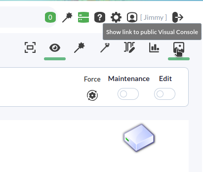
Each element can be linked to another Visual Console for calculation purposes and final availability, and also to quickly access linked visual consoles. They also optionally include a grid to align elements:
Visual Consoles have an additional functionality to share them via a public URL with any user outside of Pandora FMS:
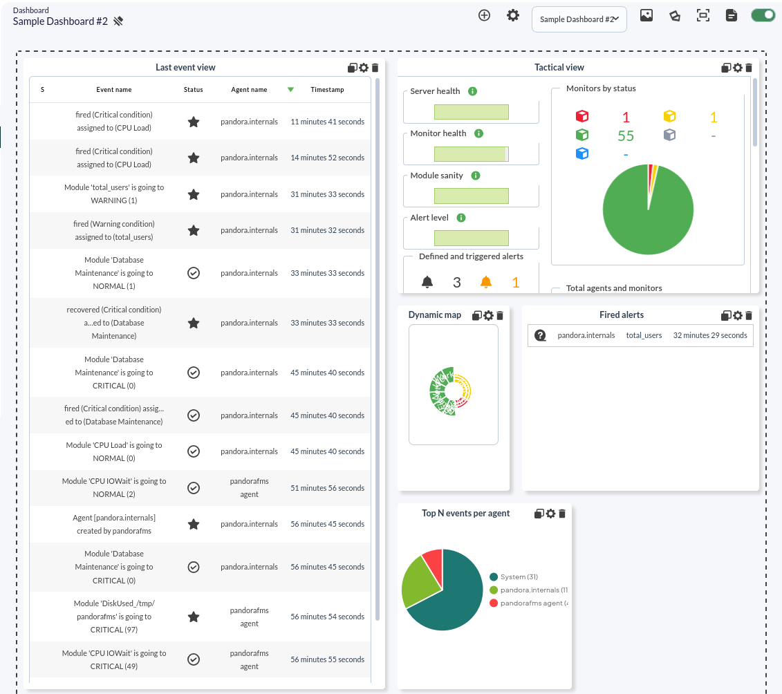
Dashboards
Pandora FMS allows the creation of individual monitoring pages for each user, in which more than one window can be added to include different monitoring maps, graphs, or status summaries.
Several different widgets can be added to each dashboard, each occupying one cell. Each widget has its own characteristics and configurations.
Within a dashboard, we can include more than 20 different widgets that allow data to be displayed with a list of events or with module graphs.